︎Existing in Movement ︎Julia Schäfer︎Existing in Movement ︎Julia Schäfer︎Existing in Movement ︎Julia Schäfer
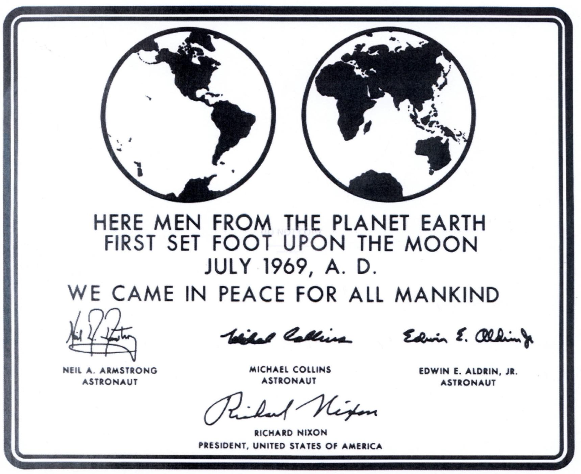
Imprint of the Apollo 11 plaque.
Existing in Movement
Julia Schäfer
Julia Schäfer’s vision for the look of Maquette 4 reflects a practice grounded in rigorous technical training mixed with an expansive sense of curiosity, energy, and openness. Her concept for the issue, she explains, “explores the tension between control, unpredictability, and system, both in humans and technology.” Many of the details pull from NASA’s Apollo 11 mission visual identity, including the Futura typeface.
Born and raised in Basel, Switzerland, Schäfer grew up surrounded by art and was instinctively drawn to the social aspect of viewer and creator engagement. She studied Visual Communications at Zurich University of the Arts, completed a yearlong Erasmus exchange in Bristol, and was working at a studio in Vienna when she was encouraged to apply for a masters at Yale. She received a scholarship, graduated in 2020, and is currently the Design Director at MoMA PS1.
“Design is such a ubiquitous term,” she says, citing a range of untraditional references. “I was always really interested in how technology influences the body, and vice versa.” She credits her art educator father for advising her to “never say no” to even the most outlandish creative ideas, and her nurse practitioner mother for fostering an awareness of the body, disabilities, and accessibility.
As we put these pages together, I asked Schäfer to create a special spread for the interview with Takashi Ikegami. The results fizz with humor and ingenuity. For our online edition, she chose a bright red to identify Issue 4: “After Apollo 11, NASA decided to add red stripes to the commander’s spacesuits so they would stand out in photos and video. In the same way, red here works as a signal—something that cuts through, grabs attention, and guides the reader’s eye.”
—Alex Zafiris
Alex Zafiris: When did you realize you loved design?
Julia Schäfer: I didn’t know what graphic design was, until I did it. I was always really interested in CDs, DVD booklets, and pop culture materials, like the techno magazine Front Page, and also Bravo. I didn’t have access to a lot of American culture. As a teen, I went to a lot of raves and saw the posters and flyers. I was really drawn to cultural spaces where people can freely express themselves, whether on a page, in a magazine, or in an actual physical, shared space; I include here early website designs or interfaces, for example MSN Messenger. I was really fascinated by media: how people interact with it, and how it can create community. My earliest memory of it is from high school. I made a book in a class with a computer program, and printed it out. I loved the process of bringing something to life that you then share with other people.
AZ: Do you feel that growing up in Switzerland had an influence on your design?
JS: Growing up in Basel influenced my desire for a global outlook. It’s a very multilingual place. It has around 40 museums and is, of course, the birthplace of Art Basel. So I wouldn’t say that design was really at the core of my influence. It was more the arts. Basel has a long collecting tradition—the first art collection there was accessible to the public in 1661! This environment gave me the curiosities and ideas to think about how visual language can shift across contexts. I was actually really excited to leave Switzerland, once I learned the tools. While everything there is already very well designed, and the quality of production is really high, I felt there was not so much for me to do. At the time, it felt like the scene—mostly defined by men—was lacking representation and critical discourse. I did not see myself in that. I felt a hunger to see how design operates in a broader, more open context.
I felt a hunger to see how design operates in a broader, more open context.︎I felt a hunger to see how design operates in a broader, more open context.︎
In terms of early influences, I have some really fond memories. One was seeing the “14 Rooms” exhibition, curated by Hans Ulrich Obrist and Klaus Biesenbach, during Art Basel. There were 14 rooms with performances that you could visit and go into. What stayed with me was this quote from Obrist: “When the last visitors leave, and the gallery closes its doors for the evening, the sculptures will all walk out as well.” I love that. It felt to me that art is something that’s alive, that exists in movement, rather than something fixed. Seeing work by artists like Ed Atkins, Pipilotti Rist, and Francis Alÿs made a strong impression. It wasn’t about my emotional response, or graphic design. I was interested in the artist’s work.
AZ: You mentioned in your design proposal for this issue that “chaos and control” is almost like a description of your job. There is a lot of unpredictability in bringing together a magazine, which I enjoy and I sense that you enjoy too.
JS: One hundred percent! I also feel that I didn’t choose to become a designer, but it chose me, because it suits my character. It can be a long, chaotic process, but making sense of other people’s ideas is rewarding. Design tries to create hierarchy, systems, proportion, and frameworks that help make content more accessible. That’s why I felt this was the perfect theme for me to work on. I also think that designers need to be good at listening and maybe less at talking. They often think they need to find and present a solution, while I think the answers might reveal themselves in the process. It’s important to trust in that. I personally get really bored when I already know the outcome. That is what’s also really interesting about working with artists and writers: oftentimes, they need help to structure their thoughts. They don’t think about the outcome, per se, or have a fixed idea about what something has to look and feel like. Taking someone on that journey is really meaningful.
AZ: Tell me about the typeface you chose for this issue.
JS: I chose Futura, which was drawn by Paul Renner in 1927. It was originally developed as a contribution to the New Frankfurt, a radical affordable housing project in Frankfurt, Germany. Renner was an interesting figure, because he was a very outspoken critic of the Nazis and wrote this essay, “Kulturbolschewismus? (Culture Bolshevism?)” where he speaks out against the Nazi campaign against modern art and architecture as being racist and dangerous. He was someone who really pushed against their ideologies very publicly, which made him have to leave Germany, and he went into exile in Switzerland.
What I found really interesting is that Futura then became the first typeface that was on the moon. It appears on the lunar plaque that was left by the astronauts of the Apollo 11 mission in 1969. NASA chose it because it would be highly legible on the moon, with very harsh sunlight—and it was durable enough to be engraved on metal. It really captures the ethos of the time: super modern, but also extremely functional. It was not only on the plaque, it was also on the maps, the cabins, the packaging for the space food. It really was an indelible part of the Apollo mission, and even appeared in the handbooks for the astronauts. These became the inspiration for the design of Maquette 4, including all those little surplus print impressions.
AZ: I also asked you to come up with a special spread for the Takashi Ikegami story.
JS: Yes, it’s an outlier. It ties directly into my original concept of Maquette 4, which explores this tension between control, unpredictability, and system, both in humans and technology. I wanted this section to feel slightly haunted by this idea that machines—even when they are designed for precision and perfection—can develop their own agency, quirks, and desires. I was thinking about the domestic side of technology, and this idea that home printers come to life at night. Maybe they make strange noises, or randomly print pages with gibberish text. The owners of these machines are posting these pages in online forums, trying to decode and understand what’s going on, and looking for support. I took some of their uploaded cries for help and wove them into the layout.
It’s a moment when the system slips behind the frame that it was intended to be in.︎It’s a moment when the system slips behind the frame that it was intended to be in.︎
I think there’s something both intimate and uncanny about this relationship we have with our smart fridge, our printer, or our phones. In his interview, Takashi describes how installing a large language model in his android ALTER allowed them to understand and imitate human speech, and then, soon after, even without prompts, they began participating in a group conversation on their own. It’s a moment when the system slips behind the frame that it was intended to be in. This felt central to Maquette 4, and these spreads for that story suggest that our tools, whether they’re a home printer or a very intelligent android like ALTER, carry this desire to intervene and join in. I thought it was an interesting take on it. I like to think that everything has a ghost in it. Books, also, very much carry that for me.
AZ: You also used color, as a reference to Ikegami’s connection to Madeline Gins and Shūsaku Arakawa, who in turn, claimed that there is no such thing as a mistake.
JS: Yes. We also have these powerful images of the android installed in a gallery. I wanted to have something very abstract interfering with them, not something that tries to analyze them, but something more. It’s not trying to explain Takashi’s work and thinking.
AZ: You work in book and exhibition design, and create your own artwork.
JS: Yes. One example that I just love was so fun: It was a collaboration with the artist Soomin Shon, a friend I met at Yale. For a video performance piece, we fabricated a coin that had the title of the show, “If Reality Is the Best Metaphor,” on it. The original subway token was an inspiration, like a visual anchor. It was an exhibition announcement, which also made it into a publication that became part of the exhibition. The token lives on, which is very nice.
I also love an exhibition, “PALM,” I did with a childhood friend, Michèle Degen. She’s a writer and poet. We were both working in a titanium implant factory in Dreiländereck in Switzerland. This was between my first and second year at Yale. It creates implants for surgeons to put bones back together after a bad fracture.
PALM, wood and yellow paint, 2023. Courtesy Galerie Hebel_121, Basel.
Image by Ernst Kehrli.
It reads like a comedy: I was in the plates department, and she was in the screw department. What started as this purely moneymaking job unfolded into something very meaningful, which also influenced my thesis at Yale.
One thing that really stuck with me was that the machines were doing so much of the work. It was very loud and noisy. It’s almost like you’re in a city of machines, and you’re on the sidelines. The laser cutters, the mills, the washers do all the work, and you’re there to monitor and move things around. There was a lot of time to get to know my co-workers, who were mostly former car mechanics, switching into the medical field. It was a super interesting time to learn about the body, but be surrounded by machines. For the show, Michèle and I drew these implant shapes from memory. The factory produces over 250 types of implants, and I had those in my hands every day for a couple of months. We recreated some of them by scaling them up and laser cutting them out of wood. We showed them in a gallery in Basel alongside some enlarged, hand cut screws and other materials from the factory.
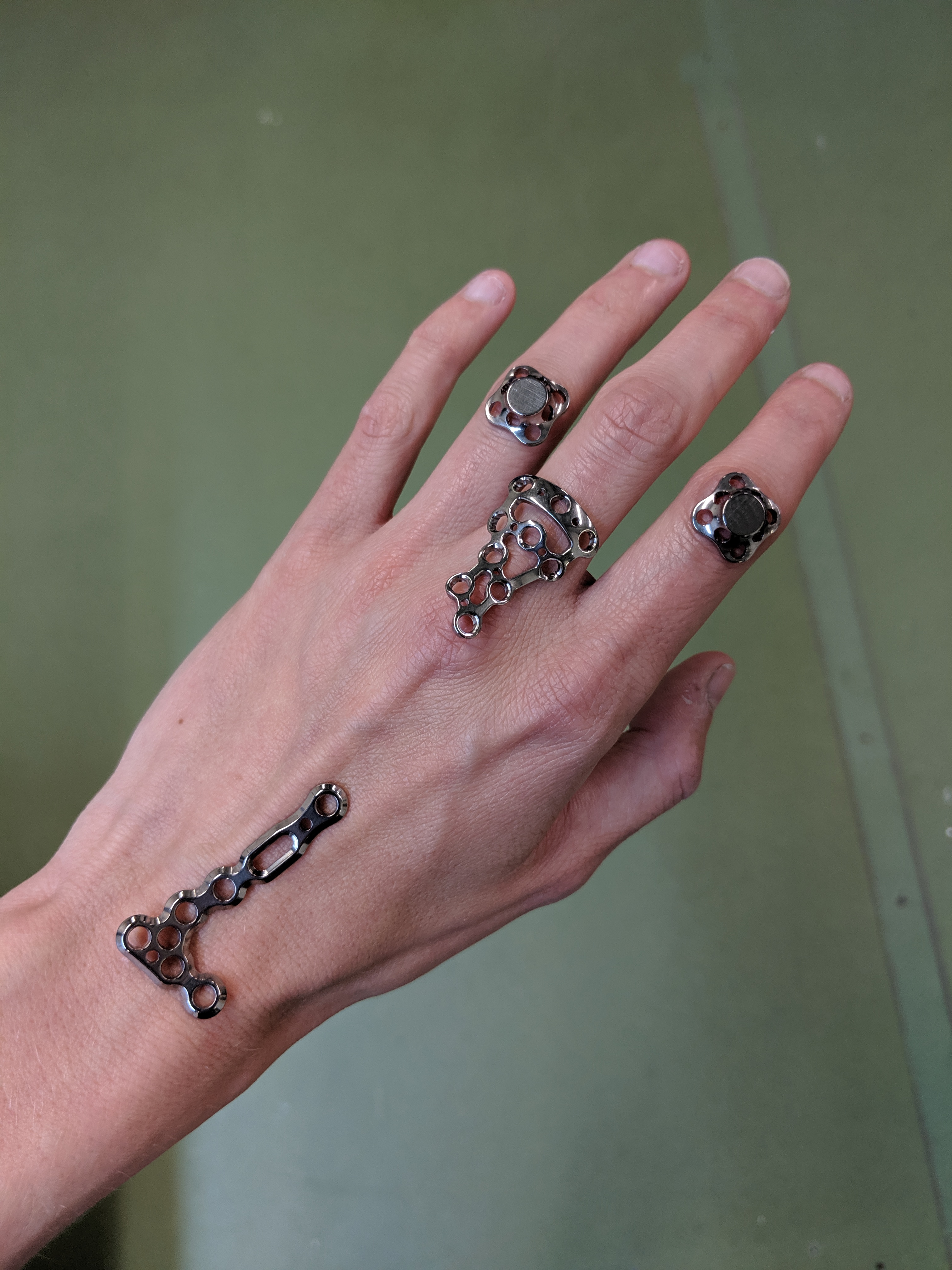
Hand with Implants, 2023. Image by Julia Schäfer.
AZ: There is a lot of humor in your work, which connects strongly to my and Dana Karwas’ energy as well. Do you think about that when you design, or is it instinctive?
JS: I think humor is very important to not go crazy! And to not get too buttoned up. Humor can be a really interesting device of surprise, a way to keep a reader or viewer on edge, or throw them off. It can be a provocation. With designers like Karel Martens and Linda van Deursen, their work is not funny, but they have humor that feels very refreshing and always new and alive. A mentor of mine always says, “Julia, we’re not saving people’s lives with graphic design.” That ethos of not taking yourself too seriously is not only helpful in the profession, but also life in general. My dad, who is an art educator, always told me, “never say no.” No matter how crazy or big or small an idea is, always stay open and trust the collaborator.
AZ: How has being a designer surprised you?
JS: I didn’t travel growing up. My first flight I took when I was 17, to Berlin to see Richie Hawtin play at a club! When I came to Yale to do my MFA, it was my first time in America. It was a big shock. I didn’t know anyone in the US. My English wasn’t great. I didn’t have all the cultural context. I would have never, from my own imagination, ever thought I would live in New York one day. That was really a random occurrence, not on my radar at all. What surprises me the most now, looking back, is how much design can carry you across borders. I wasn’t aware, choosing design as a profession, how open it is.