Prototype
Luiza Dale and Tuan Quoc Pham on the design of Maquette
Luiza Dale and Tuan Quoc Pham are graphic designers whose work readily embraces conceptual thought. Individually, their practices span a wide, thorough range of influences; together, their talents produce invigorating results. They launched the design of Maquette in early 2020, providing readers with a coherence and playfulness that grounds the many different voices that appear in each issue.
Dale works with artists, cultural organizations, and publishers to make identity systems, websites, and print publications. Additionally, she runs Quickbooks, a small press that sheds light on short pieces of writing. Pham weaves in and out of graphic design, collaborating with cultural institutions and nonprofits. He is interested in meditative ways of making, familiar technologies, and publishing. Dale and Pham met during their MFA studies at the Yale School of Art and currently work on commissions under the name The Aliens. Together, they design the annual journal CLOG.
When Dana Karwas and I met with Dale and Pham to discuss the look and feel of Maquette, they knew instinctively how to contain the constantly evolving tensions of interdisciplinary art. Their first proposal is the one you see here. I asked them three questions to elaborate on their process, and they answered—true to CCAM form—in open conversation with each other.
—Alex Zafiris
Alex Zafiris: Designers have always played a critical role in how a reader can appreciate texts and artworks. Maquette is focused on creating a clear and meaningful discourse around new and complex ideas in creativity and technology. Could you walk us through how you came up with the branding?
Tuan Quoc Pham: Hi Luiza!
Luiza Dale: Hello, hello! Ok so, how did we get to where we are today with Maquette?
TQP: Well prior to starting on the design of Maquette, I was able to take a couple of courses at CCAM. The first was 3D modeling with Justin Berry and the second was “The Mechanical Eye” with Dana Karwas. Both acted as introductions to various technologies available at CCAM such as 3D modeling and animation, motion capture, object scanning, VR, and other things I didn’t readily have access to before. But what really attracted me was how they approached using these technologies through a conceptual lens closer to how contemporary artists work.
LD: It’s great to see a place like CCAM focusing on this kind of approach with other departments at the university, such as the Yale University Art Gallery, School of Engineering, School of Drama, and School of Architecture.
I was in and out of CCAM too during my first year at Yale and it was beyond exciting to meet with Dana and Alex Zafiris to discuss the redesign of Maquette. They were trying to establish the publication to communicate CCAM's vision to a broader audience outside of Yale which really attracted us. We had a big opportunity to create something from scratch and Alex and Dana were very open to our ideas.
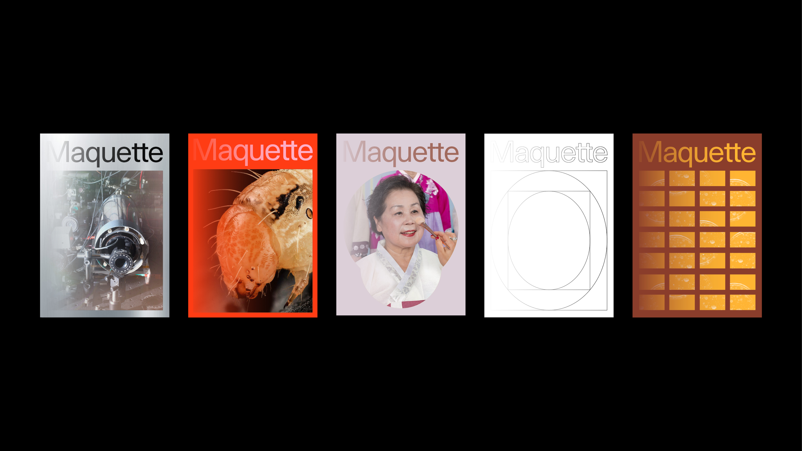
TQP: We started the design process at a pretty basic level, with the definition of what a maquette is.
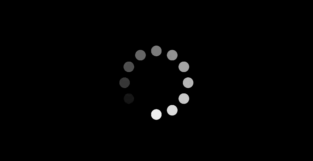
LD: Right. A prototype, a test… I remember holding on to the idea of something that is always changing. Which is fitting since CCAM works with so much technology that is in constant evolution. Here's an early sketch we presented:

TQP: I think that this metaphor helped make things feel more open for me. Not to be cliché, but to think about the journey and not necessarily the destination. It is how maquettes should function, right? As a way to navigate our ideas when they’re still nascent and malleable.
LD: Right. We knew that’s what we wanted to convey conceptually and from a visual standpoint, we kept it simple with graphic devices that evoked the “in progress” idea, like a loading bar.
We wanted to make a system that would allow for different kinds of content like interviews, long and short-form writing, and images of varying kinds. We went with a black and white palette that can take cues from images for accent colors.

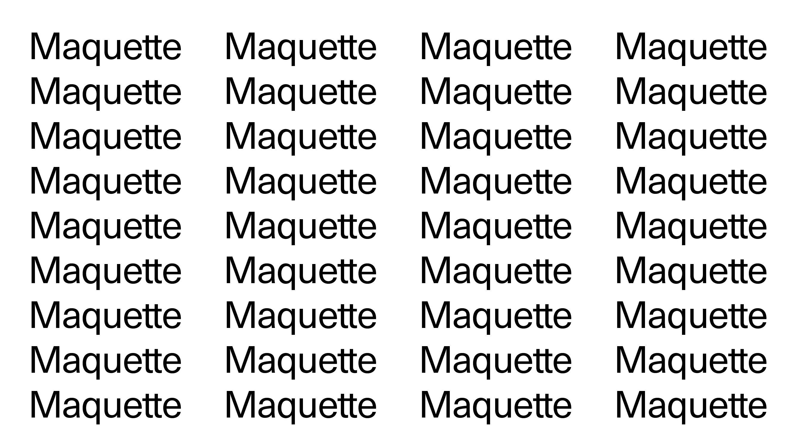
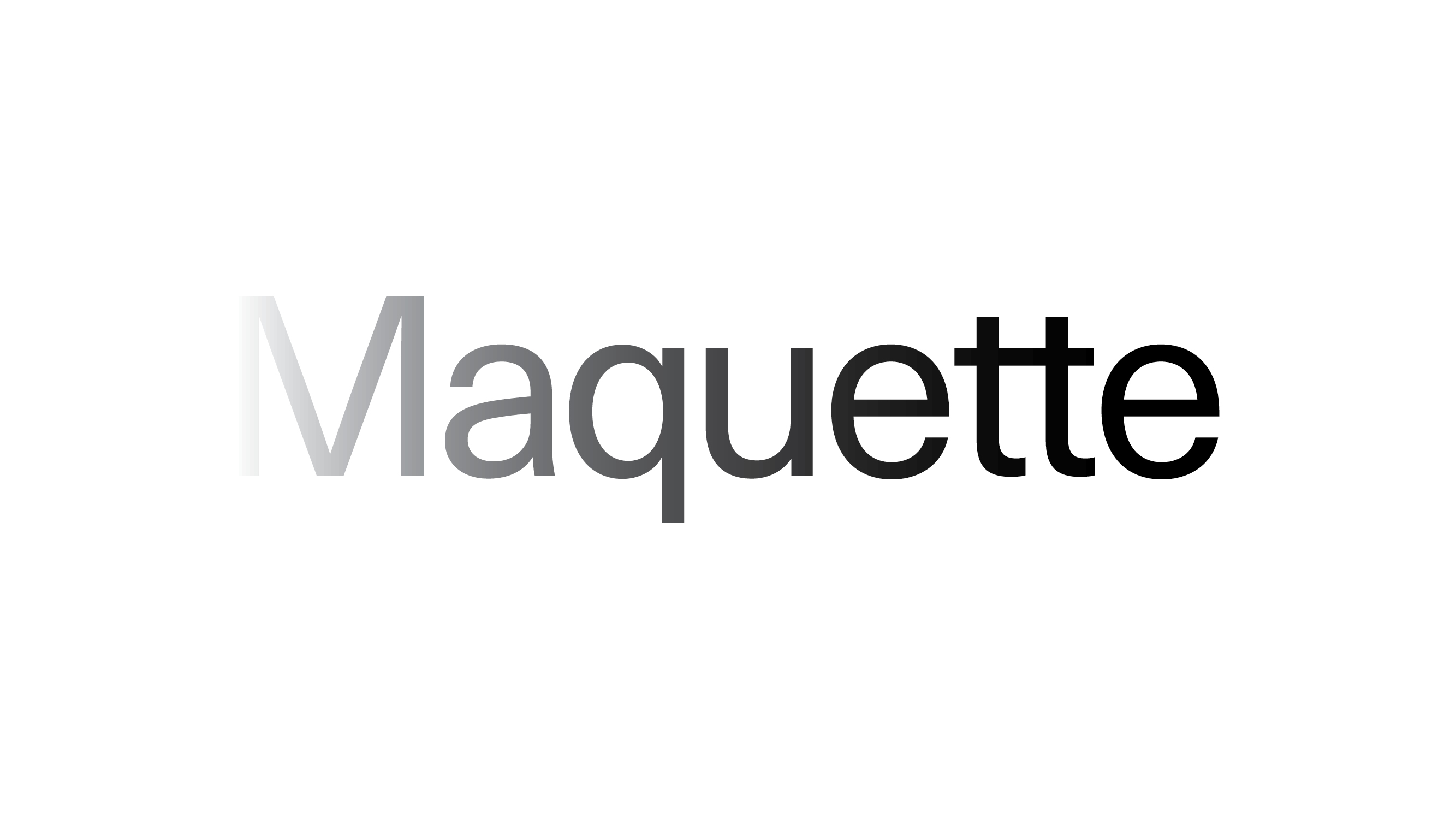
The wordmark is set in Neue Haas Grotesk, with a custom “tt” ligature that subtly alludes to a pathway. It's sometimes used in repetition to create a pattern.
TQP: Neue Haas Grotesk was a sans-serif typeface created in the late 1950s by Max Miedinger and re-released by the Commercial Type foundry in 2010. We chose this neo-grotesk because it was designed with high fidelity, which makes for legibility and clarity on both print and web applications.
We also brought in a handful of ways to render the content as if it was loading or like they were ideas that were so new and big, they couldn’t be seen all at once. Gestures like having images and text fade in, or using a scrolling marquee.
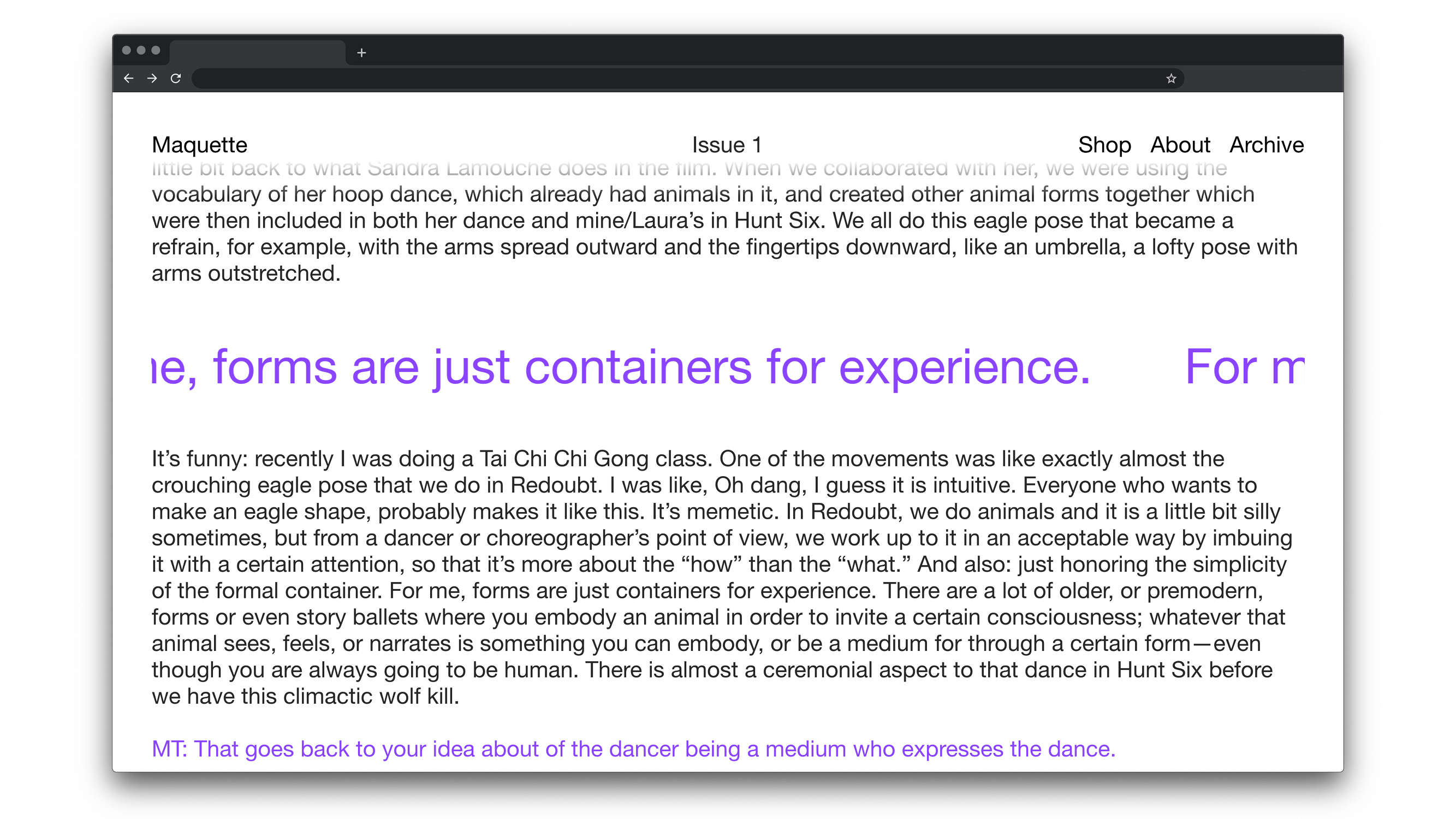
LD: We knew we had two big first expressions of the identity: a print publication and an online one. The website would need to host not only the current issue of Maquette, but archived past issues too.
In print, the “in progress” quality was translated into moves like a hyphenated title that breaks to the next line, and images that bleed from one page to the next.


TQP: Thanks to being a part of Yale, Maquette has access to remarkable photographers from the School of Art’s MFA program. Knowing this, we wanted the cover to be minimal and celebrate the issues' imagery.
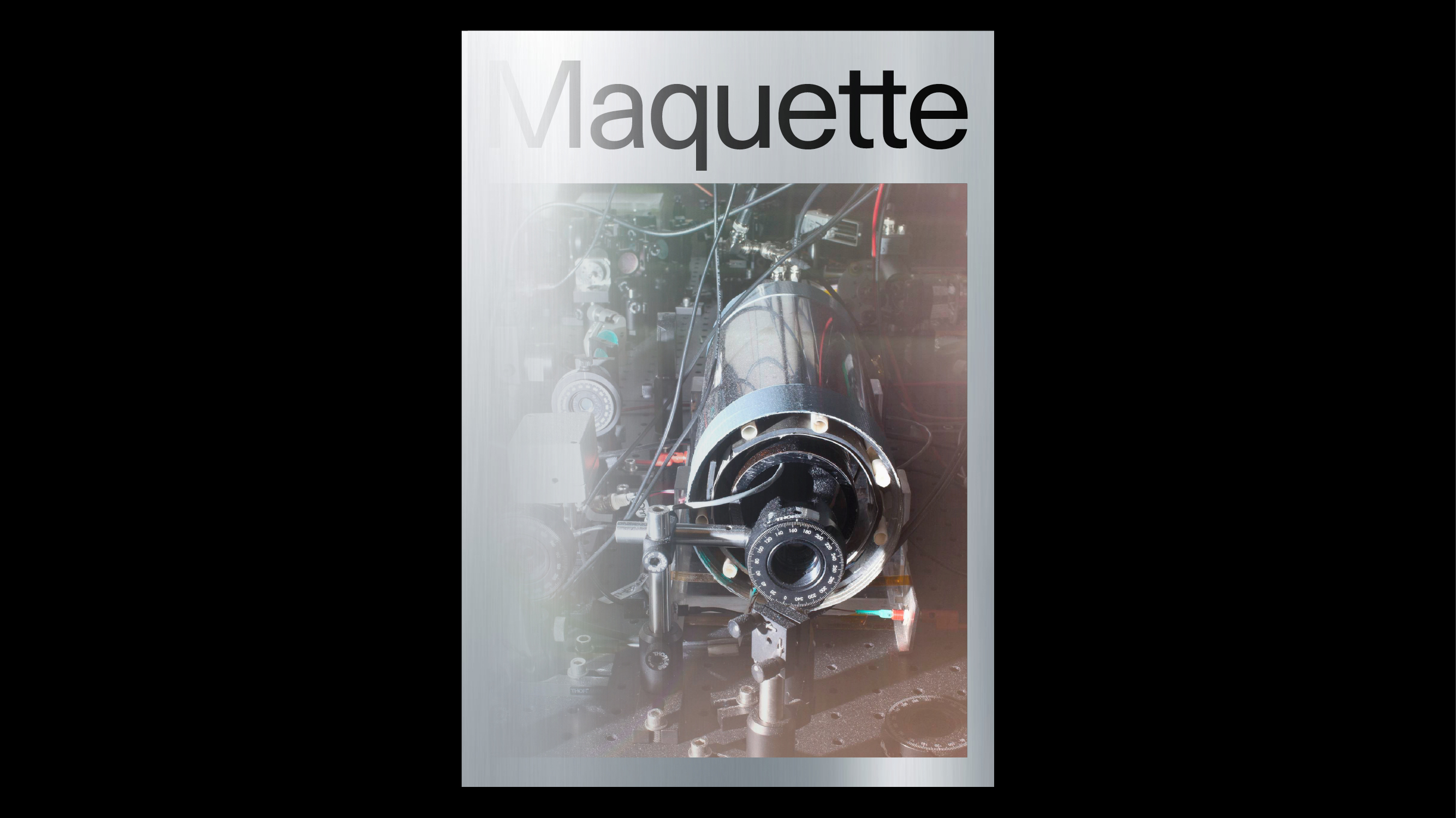
With this basic structure in place, there was a lot of freedom left to be expressive with materiality, color, and layout. We wanted there to be potential for these elements to react to the photography and content in a way that subverts the expectations of what a technology-centric publication is like.
LD: For the website, we wanted to animate the content to move on the screen like a scrolling marquee.

This includes the articles’ titles, author names, and pull quotes which all move in an infinite loop.

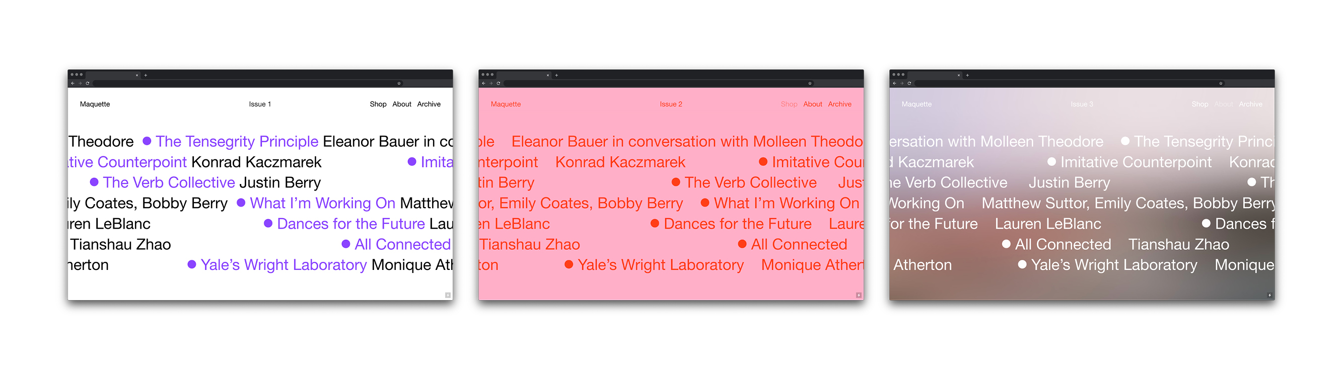
LD: It would be fun if we could add some copy on the website that explained how it’s in a constant state of revision.
TQP: I could see that being an aspect we embrace more and more. As a reflection of emerging technology and art, how could the design also feel like something in flux? What does a contemporary maquette look like?
AZ: Design and art are generally considered different mediums, usually because of various economic and consumer contexts. But both are about communication, emotion, and experience, and many of the same problem-solving skills are required. With the increasing availability and ingenuity of new programming and software, could you tell us about how you negotiate these layers in your own practice, and in client work?
TQP: I think for me, it’s about having my own sensibility that the content I’m working with has to be filtered through. There’s something special in the work when it leaves space for meditative moments through simple, distilled moves.
I’ve been rewatching the films of Hayao Miyazaki who describes the incorporation of such moments as ma, a Japanese word meaning emptiness, such as the one in between claps. By placing emphasis on these junctures, it opens them up to wider dimensions when they’d be overlooked otherwise. Design provides similar opportunities with content by allowing audiences to focus on humble details with clarity.
LD: I saw a recording of Rumstick Road this Spring that I've been thinking about a lot as it relates to my work. It's a 1977 experimental performance piece by The Wooster Group that happens through recorded conversations, letters, slides, music, and dance—all found materials. I'm interested too in using existing text and imagery to make new meanings, repurposing the existing.
TQP: I think that’s one reason we work so well together. We both have this sensibility for how content is organized and presented in a way that’s novel and speaks to affect. It’s a privilege when the project can blur any boundaries between art and design or personal and client work because of the space given to probe the same questions that orbit our own interests.
LD: Right, I agree with that. There isn't a lot of difference between "client work" and "independent work" because we're trying to make our work, if that makes sense. It's our own way of making which can adapt and change depending on the project we're working on, but the core stays the same.
That's what I look for in projects but the reality is sometimes there isn't room for that. We still need to pay the bills and with that responsibility comes work that just helps out… we still have to work for instead of with a lot of the time.
TQP: The ideal scenario is when the project allows for us and the collaborator to have a holistic and open-ended discussion.
LD: A good example is Murmurs, the creative and literary journal for the Yale School of Medicine, Nursery, and Public Health. We worked on it together over the fall of 2019 alongside Natty Doilicho and Kevin Wang, two medical students who were also the acting editors. They came to us in the early stages of gathering content for that issue which gave us the opportunity to radically shape the publication.
The theme was self-reflection, so we came up with the idea of making the book half magazine and half notebook, with lined pages inside.

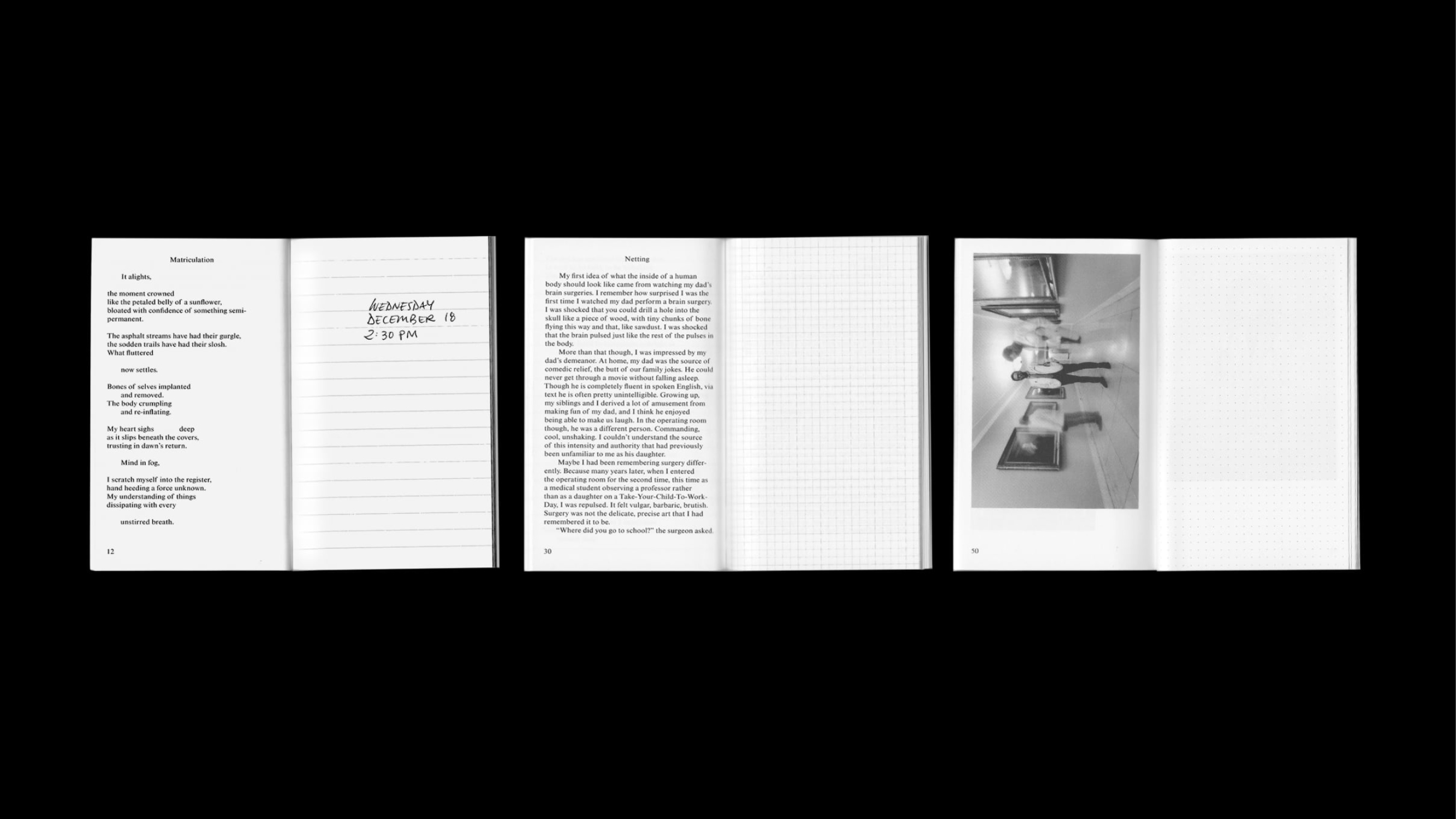
We also created a system for future publications that relied on the pill shape to host different kinds of content on the covers.

TQP: The self-reflection issue came with a ballpoint pen and was small enough to fit in a lab coat pocket, encouraging one to carry it with them and occasionally scribble down a note or read a poem.
It was critical for the design to be part of the discussion early on so that the form could be shaped concurrently with the content as opposed to being a finishing touch at the end of a project which is how it’s commonly approached.
AZ: Please tell us how technology influences your work—from very basic tools such as a pen and paper, to the newest, such as AI.
TQP: There’s a tendency to use technology to look forward but I feel like your work tends towards the opposite. You use technology as a way to excavate and reflect on the past. Do you think that movement between times is critical to your work?
LD: I think so. I was just reading Are we human? by Beatriz Colomina and Mark Wigley, and they talk about how humans keep making the same tools over and over, repeating themselves to know who they are. I like to think about how we create in order to understand ourselves better, and am often inclined to research ways in which people have done this in the past.
TQP: Oh, so like the projects you did recently with the photocopier...
LD: Right, I spent a lot of time thinking about appropriation through my work over the past few months and became specifically interested in exploring the relationship between women and copying. I made a book that compiled instructions from the Xerox 914 copier manual alongside screengrabs of Xerox commercials of the same machine from the 1960s. I wanted to explore the long history of women confined to mundane office tasks like copying and the trend of women artists being deemed copyists too.
Women and Xerox, Luiza Dale, 2020.
TQP: I think authorship is one of the things brought into question by technology from both now and prior. With more people gaining the access and ability to maneuver new programs and hardware, authorship feels more and more difficult to define. Machines do a lot of the legwork for us, labor is outsourced, no one asks who the creator of a meme is...
But I still think there’s an underlying sense of humanity in technology as it exists within a network of people, both those who created it and those who experience it. It becomes a part of the way we navigate the world and attains new contexts and meanings. The same way an unexpected postcard from an old friend feels special to us, so could the phrasing of a security question or a glitch in Photoshop.
LD: I find that's the biggest quality of your work: looking for poetic moments in the everyday.
TQP: Definitely. I don’t think my work necessarily focuses on technology but it feels unavoidable considering how we are constantly adapting to a new normal where it’s not a complete erasure of what came before but a mix of the old and new in our lives.
I’ve been making performative work that feels like a collaboration with my computer and thinking about how mundane things, whether it’s an envelope, a pack of cards, or a computer password, can become proxies for us to talk about our experiences.
A Password Is An Ellipsis, Tuan Quoc Pham, 2019.

I Thought You Should Hear This, Tuan Quoc Pham, 2019.
LD: I often think of our everyday interactions with technology too. I'm always on my phone and texting is a big part of my life so I wanted to make a tool that explored it as a form of publishing. I recently developed Public Texting, a website through which you can document an SMS conversation between a sender and receiver online in real time. I used it to publish a conversation with our peer Julia Schäfer about her experience working with machines in a factory over the Summer of 2019.

Public Texting, Luiza Dale and Willis Plummer, 2020.
TQP: It’s like a phone platform for instant publishing!
LD: And like a lot of things, very much still a work-in-progress...