︎Set + Play︎Jun Jung︎Set + Play
︎Jun Jung︎Set + Play ︎Jun Jung

Rules and Obedience, Jun Jung, 2019.
Video, 1 min 16 sec, 1920 × 1080 px, 29.97 fps.
Set + Play
Jun Jung
As a graphic designer, Jun Jung’s diligence and precision is offset by a willingness to explore contradiction. Born and raised in Seoul by a fashion designer mother and engineer father, he was inducted into a world of discipline and creation. Before arriving at Yale in 2019 to complete an MFA, he had already won the Red Dot Award in Communication Design three years running and honed his interest in books and typography while working with the legendary Ahn Sang-soo at Ahn Graphics. During that time, he also founded and ran a magazine, Tel, an investigation of design culture in East Asia, for which he won the Best Prize at the Beautiful Typography Books of the Year. Since graduating in 2021, he has worked as a Senior Designer at Pentagram in New York, extending his interests into branding and environmental design.
While putting together the editorial, I also asked Jung for some input in the art direction of the online edition. First, he chose the refreshing green color to mark the third issue, which, he explains, “feels like the gems that we stumble upon.” He brought in work by the painter Brennen Steines (MFA ’21) to illustrate a talk between David Caruso and Zorana Ivcevic, and worked with Madeline Pages (YSD ’22) on her striking image selections. His print layout takes Maquette into new territory with typefaces, collages, tensions, and surprises.
—Alex Zafiris
Alex Zafiris: One thing I love about graphic designers is that many of them became designers later in life. It is a talent that develops with awareness. What were you like as a young artist?
Jun Jung: I really loved drawing. I was fascinated by Japanese comic books, like Dragon Ball. I wanted to imitate those images as closely as possible and spent all my days practicing on my own. Over time, I got really confident, and all my classmates really loved what I drew. My mother is a fashion designer, and my father is an engineer. They have very different dispositions. She is emotional and intuitive, and he is rational and logical. I am a mixture of their characters. My mother used to work on her designs really late, and sometimes would wake me up to ask, Which one do you think works better? And I would say, In terms of the form, this one works better. My eyes were trained very, very young. I wanted to be a painter, but I also knew I had this rationality that I inherited from my father. Later, as a middle schooler, I learned more about this job called ‘designer’, which seemed to require both logical thinking and an artistic point of view. I felt that it would be a good fit for me, and decided to go down the path.
AZ: When did you start focusing on typography?
JJ: I fell in love with it when I was in college. I have the tendency to try to perfect everything. Typography is about getting into the small details, and believing that those details will make a difference. When I was a freshman, though, I thought typography was really boring. I had been paying attention to moviemaking. Compared to this, typography seemed too static. But a book changed everything for me: Stop Stealing Sheep by Erik Spiekerman. I read it when I was in the UK as an exchange student. I had forced myself to read it; it was the first time for me to study abroad, especially in the Western context, and I didn’t want to lack the fundamentals of graphic design. But I fell into it. The book uncovers the magic behind typography. I didn’t know how versatile it is, how many emotions it could express, the subtle nuances it can allude to. Since then I’ve collected books about design and architecture because typography often plays a significant role in the medium. I spent almost two thirds of my salary buying books overseas. I went crazy. I learned so much, just by intuitively looking at the design, and trying to guess what the intention of the designer was. When I was working for Ahn Sang-soo’s firm, I wanted to give myself and work colleagues more freedom aside from commissioned projects, and ended up initiating a magazine, Tel. The budget was tight, and I was both the editor and designer, which gave me lessons on how to amalgamate form and content. For the first issue, I wrote an article analyzing a book designed by Karel Martens. He is a senior critic at Yale. Much later, during his workshop at Yale, I got the chance to talk with him one-on-one. He told me that someone had sent my article to him!

Yale Stairway, Jun Jung, 2019.
Book, video, and installation: 8″ × 10″.
Book, video, and installation: 8″ × 10″.
AZ: Tell me about your experience at Yale.
JJ: It was a great learning experience, with a bit of pressure. Sheila Levrant de Bretteville shaped the program to let designers find out their unique color. Such self-centered pedagogies may sound liberating but are never easy. In my first year, I took a class called Moving Image Methods. It was by accident, because I wanted to take Letterform Design, but I didn’t get in due to the limited capacity. Later it turned out that it was a blessing in disguise. For the last class, we presented our final project. I brought in something that I felt really confident about, because I found it visually attractive. I had been working on a very self-oriented, personal project, but flipped the direction entirely a week before the presentation, just to make sure my work was visually striking. The feedback was totally different from what I was expecting. Neil Goldberg, the teacher of the class, said, Why did you change your direction? This is not personal. You seem not confident enough about your previous work. You don’t trust your audience.
AZ: Ouch.
JJ: That gave me the realization that I need to be more honest with my intention, not focusing on how it looks. Luckily, I had an extra week to modify my work for the last crit of the semester. I brought back my original work with a few new clips added. It was a process of being vulnerable in front of my classmates and critics, because I could not anticipate what they were going to say. So, I presented it, and suddenly critics started commending me on the video. I became so emotional. I thought about all the difficulties I had, being vulnerable in front of my friends. I felt like everyone was embracing me, the way I am. That was the best moment I had at Yale.

Relative Time, Jun Jung, 2019.
Video, 4 min 8 sec, 1920 × 1080 px, 29.97 fps.
Video, 4 min 8 sec, 1920 × 1080 px, 29.97 fps.
AZ: That was your first semester?
JJ: Yes. That experience reminded me of an essay about creativity in The River of Consciousness by Oliver Sacks. He was questioning why there are so few talented artists emerging, even though there are thousands of art students graduating from prestigious colleges and institutions. He suggested that maybe it’s because there are only a few artists who have, to use his term, “the special audacity.” That helped me understand that sometimes it’s about the attitude. Whether you had the courage to go after what you believe, even when it is against the status quo. For me, I grew up with all kinds of rules and restrictions, having been born into a Christian family. Act this way, don’t drink or smoke, things like that. I have always been struggling with those rules and trying to find my own space: Where does the boundary lie? The collective culture of Korea also added layers to my struggles. It’s different from the United States—nobody wants to stand out.
AZ: They want to conform.
JJ: Yes. I wanted to represent those society rules in an abstract way. One day I posted a sign on the front door of the School of Art, which said, PLEASE USE THE OTHER DOOR, without explanation. And I took a video of people reacting to it. Many of them conformed to the sign, and a few others ignored it.
Later I came across some architecture theories, which fascinated me: Terms like junkspace, hyperspace, and nonspace. Architects and scholars like Rem Koolhaas, Fredric Jameson, and Marc Augé all coined these words to talk about an indefensible space that controls people. Jameson took the Westin Bonaventure Hotel & Suites in Los Angeles as an example. Once you are inside, you don’t know where you are due to its insensible scale. While you are disoriented, it makes you indulge in the luxuries and lose track of time. So these terms are a critique of those architectures that trap us in certain spaces by imposing invisible rules. I also wanted to critique those rules; they dominate our perception and control us in a way that we cannot perceive.
The book cover of Project on the City II: The Harvard Guide to Shopping, a publication led by Koolhaas, unveils an important device used in such structures: escalators. Koolhaus says that they connect separate spaces, so that people feel that these are seamlessly attached. They create the sensation of infinite space, which leads people to shop more. Franz Kafka’s novel The Castle has a similar setting, although its ending is far more tragic. In it, the protagonist, K, is called to go into the castle, but when he gets there, he cannot find his way in. He ends up dead outside. He was not informed why he was called to go. It is an absurd story and helps me empathize with individuals who struggle with rules imposed on them. Samuel Beckett’s Waiting for Godot is also a case in point. The characters in the play are waiting for something, but they don’t fully understand what they are waiting for, let alone when it is going to come.
Sam Lavigne, an Assistant Professor in the Department of Design at UT Austin, mentioned Jacques Tati’s Playtime after seeing my work. The setting, especially the architecture, is very similar—it all looks like a labyrinth. But in Playtime, the protagonist always finds something funny in the convoluted structure even when he feels lost. And that’s the difference. In my project, you feel frustrated, and you don’t know what to do. But in Tati’s Playtime, the character becomes active, not passive. Julian Bittiner, Assistant Director of Yale Graphic Design, also said, Humor could be an important foil to add to your work, because you’re critiquing these big rules and societal limitations. Upon hearing that, I was reminded that Kafka’s The Castle is also very funny, even though the theme is very dark; his novel Metamorphosis is, too. Watching Playtime got me pondering about the way we react to those rules. To not just feel frustrated, but somehow spend time wisely, and enjoy the moment.
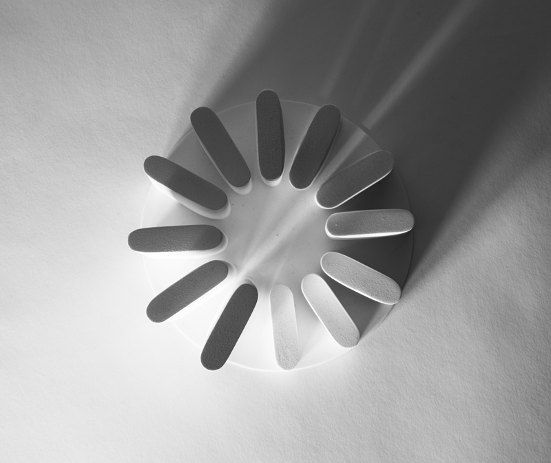
Spinning Wheel no. 2, Jun Jung, 2021.
Architectural model and photography, Styrene, 6″ × 6″ × 6¾″.
Spinning Wheel is two architectural models that I sculpted myself. When seen from above, they take the form of waiting cursors. They represent the beauty of those moments when we find ourselves in limbo. I thought about how architecture vaguely defines the way we behave, not prescribing the way we behave. Architects give us some kind of limitation, but simultaneously we are given the freedom to do whatever we want. I started looking for the balance between restriction and freedom. I was really struck by the discussion in this issue between Keller Easterling and Dana Karwas, and that they reference Playtime. Putting a character in a situation, and then finding something unexpected from the setting. That’s the balance I was looking for.
AZ: Creating your work helped you feel more free. It gave you a better outlook. It made you think differently. You had to tackle these very real feelings around these tough restrictions that are very difficult as an immigrant, but then you were able to find some peace and freedom within it.
JJ: Yes, exploring such restrictions provides me with more room for blue-sky thinking. It helps me uncover the mysterious reasons for the rules, see them in the raw, and eventually deviate from them. In this context, I also develop typefaces. I have a desire to understand how they work. The process of making a typeface entails trial and error, which informs me where people have drawn their boundaries both historically and culturally, just like learning a language as an immigrant. I believe that these studies become a springboard for unconventional forms and ideas, potentially allowing me to have a “special audacity” if I am persistent and lucky enough.
︎I started looking for the balance between restriction and freedom.︎I started looking for the balance between restriction and freedom.
“Fluctuation of Time” is a project in the same vein where I created a custom type for an anthology. The content deals with relative concepts on time. To reflect this, I extracted three different time axes from the Latin alphabet, embodying them in letterforms: Phoenicia in 14 skewed consonants and Ancient Greece in 5 skewed vowels. The direction in which the letters are skewed is reflective of the writing direction of the time, and the letters form irregular rhythms in a linear typesetting, representing the time abstractly, in flux. I also visually corrected the letterforms to improve legibility, which was grounded on the experiences that I had while drawing conventional typefaces.

Fluctuation of Time, Jun Jung, 2021. Typeface and book, 148 pp., 6.5" x 9.75".
Before our interview today, I was reading about how the rain pours from the clouds. When a cold front meets a warm front, the cold lowers, because it is heavier. The heat rises, then gets condensed. The warm front cannot hold this weight, and the rain starts to go down to the Earth. This process is called precipitation. I felt that this was a good representation of what I’m trying to achieve in my work. Trying to merge the cold, like an inhuman object or institutional things, with a human warmth so it can precipitate something.
AZ: That’s beautiful. I want to ask about the print design for Maquette. You were intent on changing the typeface, which was Neue Haas Grotesk. You chose Gerstner-Programm for the titles, and Söhne for the body text.
JJ: Yes, I came into this by starting a problem! I wanted to embark on a journey with Maquette. My classmates who designed the previous issues (Furqan Jawed + Anna Sagström, Luiza Dale + Tuan Quoc Pham) already did a fantastic job, and they took their own path. I also wanted to take this somewhere else, keeping my fellow designer’s design as their own contribution and reflecting the theme of this issue: Serendipity. That way Maquette could be multi-faceted, with a more diverse point of view. I didn’t want to make drastic changes, because I wanted to keep the continuity. I looked into the history of Neue Haas Grotesk, later known as Helvetica. It is based on Akzidenz-Grotesk, which was designed in 1898 and released by Berthold Type Foundry in Berlin. I wanted to take this root, and see what other iterations came from there. I came across Gerstner-Programm, created by Karl Gerstner in 1964. I looked closely at the history of it, and I was really fascinated by the fact that he took a programmatic and systematic approach to the typeface. I thought, This is a perfect match for CCAM. Because CCAM is also investigating the intersection between art and technology, and Gerstner was also trying to graft technology into typeface territory. That’s what fascinated me. For instance, he came up with a coordinate system, where the width and weight differ by a factor of 1.25. And I like the fact that—even though you can come up with a system—it is still hard to anticipate what the result will be. I really liked that he decided to obey his own system, and I also truly believe that he made some adjustments after he applied it. So, he followed the rules every time, saw the outcomes, and then made changes. It’s like moving back and forth between technology and art.
︎I like the fact that—even though you can come up with a system—it is still hard to anticipate what the result will be.
Söhne is also based on Akzidenz-Grotesk. These typefaces have the same DNA. Söhne was released in 2019, more optimized for readability. The designer, Kris Sowersby, stated on his Klim Foundry website that he had Helvetica in mind when designing Söhne. So even though Söhne has handcrafted qualities, it is more suitable for body text. I thought, Maybe Söhne is better for body text, and then we can utilize Gerstner-Programm for display. Those two typefaces look different on the surface, but they have the same root. Both are the result of designers’ efforts to apply technology to art, and the other way around.
In Homage to Karl Gerstner’s Designing Programs, Jun Jung, 2023. Digital mock-up.
AZ: I love the two different generations as well. Gerstner-Programm really feels of its time, a period of great change and advancement. And Söhne is very new, and feels very modern to our eyes. Using them together cultivates a special relationship to progress and intuition. Tell me about your serendipity sequence, found between each article.
JJ: I know, Alex, that you put a lot of effort to get high resolution images from our contributors. I know how painstaking that job is! I wanted to maximize the opportunity from those efforts as I always had this in the back of my mind. Last year, my fellow designers, Nick Massarelli, and Mianwei Wang, and I designed the catalog for the School of Art’s Painting and Printmaking department. We came up with a system to mix detailed shots of paintings together. I felt that we could apply this device to this issue, but in a different context—as a collage to create serendipitous moments. A collage usually means cutting and pasting to make something totally new. I didn’t want that. By simply juxtaposing different images, we can make a collage. This also came from the nature of the book. You always need a symmetrical spread, and then there comes verso and recto; you cannot help but utilize this given limitation. It’s not just one plane, but two different planes that come together. In benefitting from all this, we can reflect the themes of the issue. The images are removed from context, and they, as uncanny pairs, convey a different energy.